


HT Explains: Why Delhi's air is truly worse than Beijing's
Is it more dangerous to breathe the air in Delhi or Beijing? We know that both cities are hazardous to your lungs, but residents of India’s capital have been rattled by a growing chorus of claims that they are more at risk than people living in Beijing, the global poster-child for air pollution.
Is it more dangerous to breathe the air in Delhi or Beijing? We know that both cities are hazardous to your lungs, but residents of India’s capital have been rattled by a growing chorus of claims that they are more at risk than people living in Beijing, the global poster-child for air pollution. And not surprisingly, city and central government officials have pooh poohed the comparison, citing faulty data or modeling.

Now, for the first time, we have a single, unambiguous analysis, based on reliable data, which tells us very clearly: however you slice it, Delhi’s situation is sharply worse. Douw Steyn, a Professor at University of British Columbia with decades of experience studying pollution all over the world has obtained two-years-worth of hourly data from the monitoring station in Delhi’s RK Puram neighbourhood, and from the US embassy in Beijing. Each station measures the deadly microfine particles known as PM 2.5 in micrograms per cubic meter of air. Steyn has crunched these numbers to produce what staticians call a QQ plot (for quantile vs. quantile).
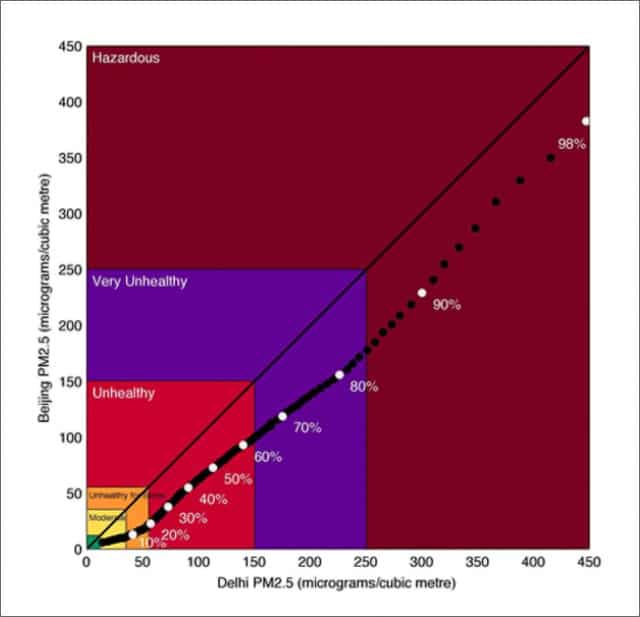
The name is complicated, but the result is simple. On this chart, if Delhi and Beijing pollution was equally bad, Steyn’s graph would follow a straight 45 degree line up the middle. If Beijing was worse, it would be above that line, closer to the y axis. As you can see, it is well below. Which means, simply put, that Delhi has fewer good periods, and more bad periods, than Beijing and that what counts as a really bad period in Delhi is worse than a really bad period in Beijing.
The color coding on the chart represents the US Environmental Protection Agency standards for the dangers associated with pollution: green means “healthy”, yellow is for “moderate” while, orange is “unhealthy for sensitive groups”. At the red level “everyone may begin to experience health effects; purple for “very unhealthy" means “health warnings of emergency conditions and the deep burgundy of “hazardous” means the entire population is at risk.
You could leave it at that, but if you want to understand exactly what the chart means, and why it matters, read on. You can also read Professor Steyn’s explanation to HT here.
As he points out, "comparisons based on annual average pollution concentrations, such as presented by the World Health Organization ignore the fact that the intermittently occurring severe days have strong human health effects". Similarly, randomly comparing individual days on a real time site like aqicn.org, while interesting and often shocking, obviously doesn’t take into account variations in weather.
To draw a statistically meaningful conclusion you need to compare the right kind of data, sampled regularly over a long time.
Steyn says that the RK Puram monitoring station in Delhi and the US Embassy in Beijing are comparable, because they are broadly representative of city wide conditions, which in any event do not show very marked spatial variation.
“These data” he points out “are collected and managed by relevant pollution regulation agencies, and are subject to rigorous quality checks”.
Steyn uses these numbers to plot the level of pollution each city experiences for a given percentage of its time, against the levels its rival hits for the same number of hours over the course of the full two years. That means his conclusions correct for changing weather and one off variations.
So: if Delhi spends 50% of its time above 113, and Beijing spends 50% of its time above 73, he marks off 113 on the x axis, 73 on the y axis, and labels it 50%, and so on across all fractions of time, from 1%-99%.
How does this help us?
Look at the dot that reads 90%. This is the 90th percentile, representing the pollution level above which our two cities spend 10 percent of their time. Come down to the X axis, and you will see that for Delhi, the PM 2.5 number is 300, well into the hazardous zone according to US norms. In Beijing, this 10 percent-of-the-time threshold is breached at 230, a comparatively less awful “very unhealthy” on the American scale.
If that is still difficult to make sense of, here is a different way to think about it. In order to qualify to study English or Economics at a top Delhi University college, an aspirant student needs to score above 98 percent, or be in the 98th percentile. In order to qualify to be among Delhi’s very worst periods of air pollution, the PM 2.5 98th percentile, a given hour of time must rack up a score of over 447. To crack entrance in Beijing it doesn’t even need to breach the 400 level - 383 will do.
As Steyn explains:
“The upper 17% of conditions in Delhi are hazardous, while 7% of conditions in Beijing are hazardous. Unpolluted conditions are found in Delhi for less than 1% of the time, while such conditions exist in Beijing approximately 8% of the time”.
Of course the situation in both cities is appalling, and unacceptable. Hopefully this analysis will help to end the debate about comparative numbers, and enable the central, state and provincial authorities in Delhi to focus on solving what is, by any measure, one of the world’s worst air quality problems.
Read: